Choices DSL
The Choices DSL is a very powerful way to give your users a choice between various options in a dedicated popup window.
Getting started
Some information you may need:
- The Choices DSL requires a
CommonEngineengine or a derivative/extension of said engine. It relies heavily on thechoicefunction provided by these engines - While you could perfectly only use the
choicefunction provided inCommonEngine, it is not a very pleasant experience, and does not provide many features either. You should definitely use the Choices DSL instead.
The choices DSL allows you to do two things:
- Set a value depending on a user’s choice
- Perform an action depending on a user’s choice
Both are very similar and only differ in how you declare the result.
Syntax & basic usage
The basic syntax of the Choices DSL is as follows:
choices {
    text { "Here are the different choices you can make" }

    choice("First choice") does {
        ...
    }
    choice("Second choice") does {
        ...
    }

    choice("Third choice") does {
        ...
    }
}
And… That’s it! You can place this bit of code in either an option’s does block, in a node’s onNodeReached block, or pretty much anywhere else.
The does block of each choice specifies what should be done when the specific choice is chosen.
You can also use the choices DSL to define a value depending on what the user chooses. Notice that the function in this case is named fromChoices and not choices
val wanted: String = fromChoices {
    text { "What do you want?" }

    choice("A smoothie") yields "smoothie"
    choice("A soda") yields "soda"
    choice("Water") yields "a glass of perfection"
}
The wanted variable will then contain either "smoothie", "soda" or "a glass of perfection". The fromChoices can be used with all object types, not just Strings: you can use it with booleans, integers, … The only requirement is that Kotlin must have a way to know which type to expect. Here, we explicitly specify the type next to the variable declaration.
Here is a more complete example which additionally shows what was chosen. Notice that, in order to access the result elsewhere, we’re using a var at the file level.
// If we're only using the choices DSL, a requireEngine call is not required.
// However, it is highly recommended so that the story fails immediately, as
// using the choices DSL effectively makes the story require a CommonEngine
val eng = requireEngine<CommonEngine>()

var whatWasChosen = "" // The default value is a string here

story {
    title = "Dilemma"

    node(1) {
        body { "Click on the option!" }
        option {"Click here to choose!" } does {
            whatWasChosen = fromChoices {
                text { "What do you want to have?" }
                choice("Something hot!") yields "fire"
                choice("Something cold!") yields "ice"
                choice("Something... muddy?") yields "earth"
                choice("Something breathable!") yields "air"
            }
            nodeRef(2)
        }
    }

    node(2) {
        body { "You chose $whatWasChosen!" }
    }
}
Cancellable
By default, there is no way to cancel a choices dialog. You can specify that a
choices dialog box should be cancellable by adding cancellable in the choices
block. If you are using choices, this is very easy:
choices {
    cancellable
    text { "Here are the different choices you can make" }

    choice("First choice") does {
        ...
    }
    ...
}
You can also specify an action to perform if the choices box is cancelled using
a doIfCancelled block, although this is not required:
choices {
    cancellable
    ...
    doIfCancelled {
        ...
    }
}
If you are using fromChoices, the idea is the same, except that you have to
specify a yieldIfCancelled. From our previous example:
whatWasChosen = fromChoices {
    cancellable
    text { "What do you want to have?" }
    choice("Something hot!") yields "fire"
    choice("Something cold!") yields "ice"
    choice("Something... muddy?") yields "earth"
    choice("Something breathable!") yields "air"
    yieldIfCancelled {
        "nothing, apparently"
    }
}
If you forget to specify a yieldIfCancelled, you will get an error. The rule
is that fromChoices must always return some value, even if it is cancelled.
Advanced
The
yieldsfunction also supports lambdas if you need some “dynamic” way of choosing which value to return, like anif. For example:choice("My choice") yields { if(something) 1 else -1 }
Customization
Options and choices boxes can be easily customized with various components in the Choices DSL.
Icon
You can add an icon to the dialog box.
choices {
    icon { ... }
    ...
}
Inside the icon block, you can either specify:
- A String, the meaning of which depends on your player. For StoryFX, this string corresponds to an icon name from Ikonli, either from this set or this one. The string should contain what is in the “Name” column.
- A Resource, using the usual
resources["resourcename.example"]syntax, which points to an image. nullto indicate that there is no icon. This is the default.
Title
You can set a title for the dialog box, which will replace the default one.
choices {
    title { "My title" }
    ...
}
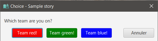
Button colors
You can change the background colors of the buttons, and set whether the text should be white or black.
choices {
    choice("My beautiful choice") withColor "darkred" withWhiteText true
    choice("My other choice") withColor "lime"
}
The color chosen can be any CSS color. In StoryFX, the supported named colors are listed here.
By default, withWhiteText is set to false to show black text over the background. You should set it to true if your background color is dark enough for the text to become unreadable.